Analyzing an Instagram Grid
Load any public profile to see its last 12 posts as a real 3:4 grid, plus the posting rhythm behind it — then plan your own feed with drag-and-drop. Free, no signup.
Auditing competitor layouts? Drag tiles in the live grid to test alternative arrangements, or switch to Planner to upload new files.




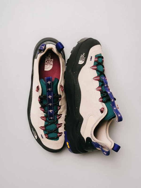
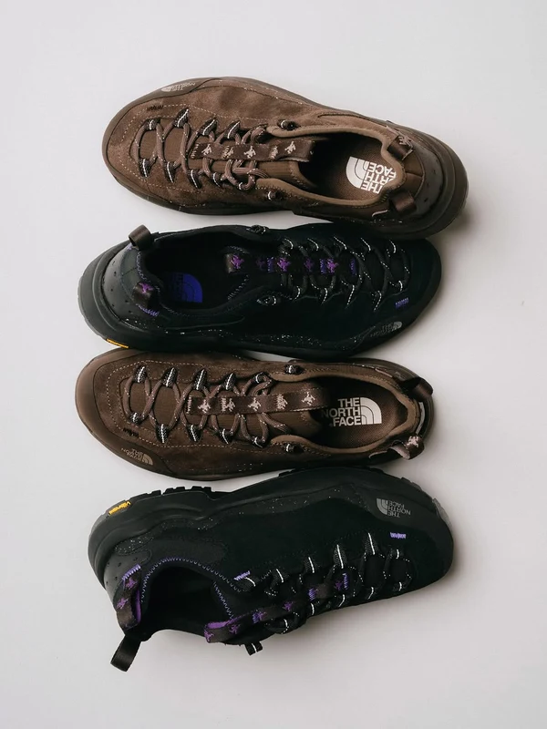
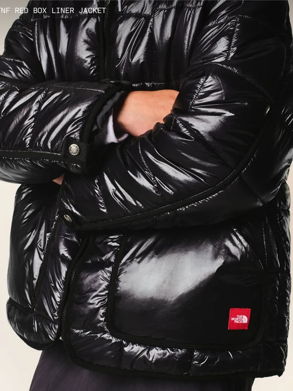



Content Format Strategy
Analysis of the last 12 posts.
Format Breakdown
Max Streak
3
consecutive Carousels
Grid Alignment
100%
100% Vertical Safe
This account posts roughly 3.5× per week with an emphasis on high-production outdoor expeditions and technical outerwear. Carousels and multi-slide campaigns drive the highest comment ratios, while solo athlete reels capture the greatest volume of video reach.
Creafico Growth Intelligence
Want to see the revenue & conversion numbers behind this grid?
Creafico monitors top creators in your niche, decodes which format rhythms drive real sales, and tracks engagement velocity before trends saturate.
What “Analyzing an Instagram Grid” Actually Means
Analyzing an Instagram grid is the systematic evaluation of an account's latest 12 public posts across format rhythm, 3:4 crop discipline, visual hierarchy, and conversion velocity. Rather than merely viewing photos through an aesthetic lens, a professional grid audit decodes how a creator balances algorithmic discovery formats (vertical Reels) with deep-retention assets (multi-slide carousels) to turn casual profile visitors into permanent followers.
Whether you use a grid viewer, grid checker, or IG grid analyzer, effective analysis looks past color filters to inspect the structural mechanics that drive account conversion.
The ratio and sequence of Reels, carousels, and photos across recent uploads.
Verifying that thumbnail focal points and titles remain centered within safe zones.
The initial 9 tiles a visitor sees above the fold before deciding whether to follow.
Visual proof of consistent niche authority that reassures scrollers of ongoing value.
Meta Announces 3:4 Thumbnails, Tabbed Highlights & Full Grid Reordering
Instagram profile architecture is undergoing its most radical transformation since launch. Understanding these structural changes is mandatory for maintaining a high-converting creator presence:

“We’re also looking to move highlights into the grid and add them as a tab. Highlights are a great way to showcase your favorite stories, but they are visually complicated and push your grid down. In order to maintain creator control we’re building a tool so you can re-order your entire grid and make it whatever you want.”
Circular story bubbles pushed your grid 200+ pixels down on mobile. Relocating highlights into a dedicated tab pulls your 3:4 grid up directly below the bio, capturing immediate above-the-fold attention.
No longer trapped by reverse-chronological order. Creators gain complete autonomy to arrange their entire post library into aesthetic checkerboards, thematic rows, or conversion funnels at will.
The 3:4 Thumbnail Crop
Instagram grids now render tiles at a 3:4 vertical ratio (1080 × 1440 px) instead of the legacy 1:1 square. Square uploads lose approximately 25% of their horizontal area to edge-cropping, while wide landscape uploads suffer severe letterboxing.
The 4:5 Centered Safe Area
When designing 4:5 feed carousels or 9:16 vertical Reels, keep primary headlines, faces, and text overlays locked inside the central 3:4 grid window. This guarantees zero cut-off text when viewed on the profile grid.
Full Profile Reordering
Instagram's native reordering tool lets creators drag and drop any post across their entire feed. Reordering changes the visual grid arrangement only; original publication dates, view counts, and comment threads are 100% preserved.
With full grid reordering now supported by Instagram, staging your arrangement before committing changes is critical. Use our Live Grid and Planner tabs above to drag and drop tiles in real time, preview 3:4 crop safe zones, and verify your posting rhythm before reorganizing your live account.
Five Grid Layout Strategies, and How to Spot Each One
Amateur creators copy superficial filters and font pairings. Veteran growth strategists analyze competitor posting rhythm and geometric architecture. Using an instagram grid planner to inspect format cadences reveals how top niche performers balance top-of-funnel algorithmic discovery with profile follow conversion.
Reading Competitor Format Cadence
Rhythm Extractor SignalsIndicates an aggressive top-of-funnel acquisition campaign. The account relies heavily on algorithmic recommendation feeds to capture non-followers.
Signals a retention-focused strategy. The creator is investing in high-save educational swipe slides that drive bookmarking and comment debates.
Standard photos are deployed sparingly as lifestyle anchors or community updates, avoiding algorithmic dilution on static single-image posts.
Interactive Live Grid Drag Reordering
Unlike static profile viewers, our Live Grid tab abovelets you drag and reorder any public account's real posts directly. Grab any post tile to test new layouts—our rhythm engine dynamically recalculates max streaks, format breakdown percentages, and vertical safe alignment in real time as you experiment with different sequences.
The Five Structural Grid Patterns
3-Column LayoutsCheckerboard Layout
Alternates two distinct post types or contrasting visual tones across every consecutive upload, producing a chessboard effect down the 3-column feed.
Row-by-Row Flow
Groups content into thematic horizontal sets of three posts. Often dedicated to a single topic, product drop, or visual color palette across one row.
Diagonal Visual Shift
Arranges a specific content type or background tint to appear every 4th post (3 columns + 1), drawing the viewer’s eye diagonally down across the profile.
Puzzle & Mosaic Grids
Splits a large panoramic image across 6, 9, or 12 individual tiles that piece together into a single master graphic.
Deliberate Irregularity
Prioritizes topic value and format fit over rigid aesthetic geometry, maintaining visual cohesion purely through disciplined 3:4 crop boundaries and branded typography.
Got your Reel covers arranged on the grid?
Ensure the video behind that cover retains viewers within the critical first three seconds.
Planning Your Own Feed: Layout Planner, Feed Planner, Post Planner
Staging your content before publishing eliminates cropping accidents and ensures an optimal format rhythm. Whether you are using an instagram feed planner, layout planner, or post planner, follow this 3-step staging workflow:
Stage in 3:4 Aspect Ratio
Upload your covers into the Planner tab above. Check that titles remain centered and that 1:1 square graphics don't lose vital text to automatic vertical cropping.
Drag to Balance Format Rhythm
With Instagram adding native full-grid reordering as confirmed by Adam Mosseri, you can rearrange existing and upcoming posts. Drag and drop tiles here to break up long streaks of identical video Reels with high-retention carousels.
Polish Bio & Typography
A great grid requires a clean header. Format your bio with precise line breaks and clear value props before running traffic to your profile.
Frequently Asked Questions About Analyzing an Instagram Grid
Direct, practical answers from live search queries regarding grid audits, 3:4 aspect ratios, and feed planning.
How do you analyze an Instagram grid?
To analyze an Instagram grid effectively, evaluate four core elements across the profile's most recent 12 posts: format rhythm, crop consistency, visual hierarchy, and the first-impression conversion zone. Rather than judging color filters alone, look at the ratio between vertical Reels, multi-slide carousels, and single images. Check whether cover images adhere to the 3:4 grid crop with centered text in the safe zone, and observe whether the creator groups posts into intentional sequences (such as alternating formats or blocked rows). Finally, inspect the top 9 tiles to ensure they immediately communicate the account's value proposition to new visitors.
What size should Instagram grid posts be in 2026?
Instagram profile grids display thumbnails in a 3:4 aspect ratio (1080 × 1440 pixels) rather than the legacy 1:1 square crop. When creating feed content, design graphics and photos at 4:5 portrait (1080 × 1350 pixels) or full 9:16 vertical (1080 × 1920 pixels) for Reels. Keep critical text, logos, and focal subjects centered within the central 3:4 safe area so thumbnails remain legible when cropped on the main profile grid, while filling mobile screens when viewed directly in the feed.
Can you rearrange your Instagram grid?
Yes. As confirmed by Instagram CEO Adam Mosseri, Instagram is actively rolling out a native grid reordering tool designed to give creators complete control to 're-order your entire grid and make it whatever you want.' Creators can reorganize their public feed posts into custom arrangements directly on mobile via profile edit options or long-pressing tiles, without altering original publish dates, reach metrics, or comment histories. Alongside this, Instagram is moving Story Highlights into a dedicated tab to eliminate visual clutter and pull the reordered grid directly above the fold.
Can you see someone else's Instagram grid layout?
Yes. Any public Instagram account's grid layout is visible to visitors and third-party tools exactly as it appears in the official Instagram app. A public grid analyzer loads the public posts, media types, and thumbnail coordinates without requiring an account login or alerting the creator. However, private accounts cannot be analyzed, and third-party tools cannot access private performance data such as story views, reach, impressions, or saves.
Does the Instagram grid still matter in 2026?
The Instagram grid matters significantly, but its role has shifted from content distribution to audience conversion. The majority of post impressions and viral discovery happen directly in the Reels feed, Explore tab, or home feed rather than on profile pages. However, whenever a viewer taps through after watching a high-performing Reel, the 3:4 profile grid is the decisive conversion surface. With Instagram moving Story Highlights to a dedicated tab as confirmed by CEO Adam Mosseri, the 3:4 grid sits directly below the bio above the fold, giving visitors an instant 3-second evaluation of whether the account delivers consistent, ongoing value worth hitting 'Follow'.
What's a good mix of Reels, carousels and photos on a grid?
There is no single universal ratio for every niche, but top-performing creator accounts generally run a balanced rhythm of 60–75% Reels for algorithmic reach and discovery, 20–30% carousels for deep dwell time and educational retention, and 5–10% photos for community connection. Rather than posting one format exclusively, high-retention profiles intersperse video Reels with multi-slide carousels to cater both to passive watchers and active readers while maintaining a dynamic visual rhythm on their grid.
More Free Growth Tools
Instagram Profile Analyzer
Instantly audit any public Instagram profile. See followers, engagement rate, top posts, posting cadence, and growth recommendations — free.
Instagram Shadowban Checker
Check instantly if your Instagram account is shadowbanned. Free hashtag-based test — no login required.
Instagram Reel Hook Generator — Free AI Hook Generator
Generate 10 Instagram Reel hooks, each paired with a visual action. Free, no signup.